Antique 1914 Thanksgiving Postcard: Farmhouse Turkey & Pumpkin
📸 Click any thumbnail to inspect Front, Back & Angles (2 Photos)
As an eBay Partner, we may earn a commission if you make a purchase.
Item Specifications
- Era: Divided Back (1907-1915)
- Publisher: The Fairman Co. N.Y.
- Series: The Pink of Perfection
- Year: 1914
- Subject: Turkey & Pumpkin Vine
- Theme: Thanksgiving Holiday
- Category: Postcards & Ephemera
- Format / Type: Vintage Postcards
Looking for Modern Alternatives?
Explore top-rated, modern Postcards & Ephemera and related historical accessories on Amazon.
Shop Postcards & Ephemera on Amazon →As an Amazon Associate, we earn from qualifying purchases.
Historical Context & Overview
Harvest Nostalgia: The Artistry of Early 20th-Century Holiday Greetings
During the Golden Age of Postcards—spanning roughly from 1907 until the outbreak of World War I—sending vibrant, illustrated cards was the primary way Americans shared holiday sentiments. Thanksgiving postcards from this era held a unique place in popular culture, capturing a romanticized vision of pastoral abundance, family hearths, and traditional agrarian roots. This exquisite 1914 Thanksgiving postcard stands as a benchmark of early American print illustration, combining iconic autumn motifs with subtle Art Nouveau design elements.
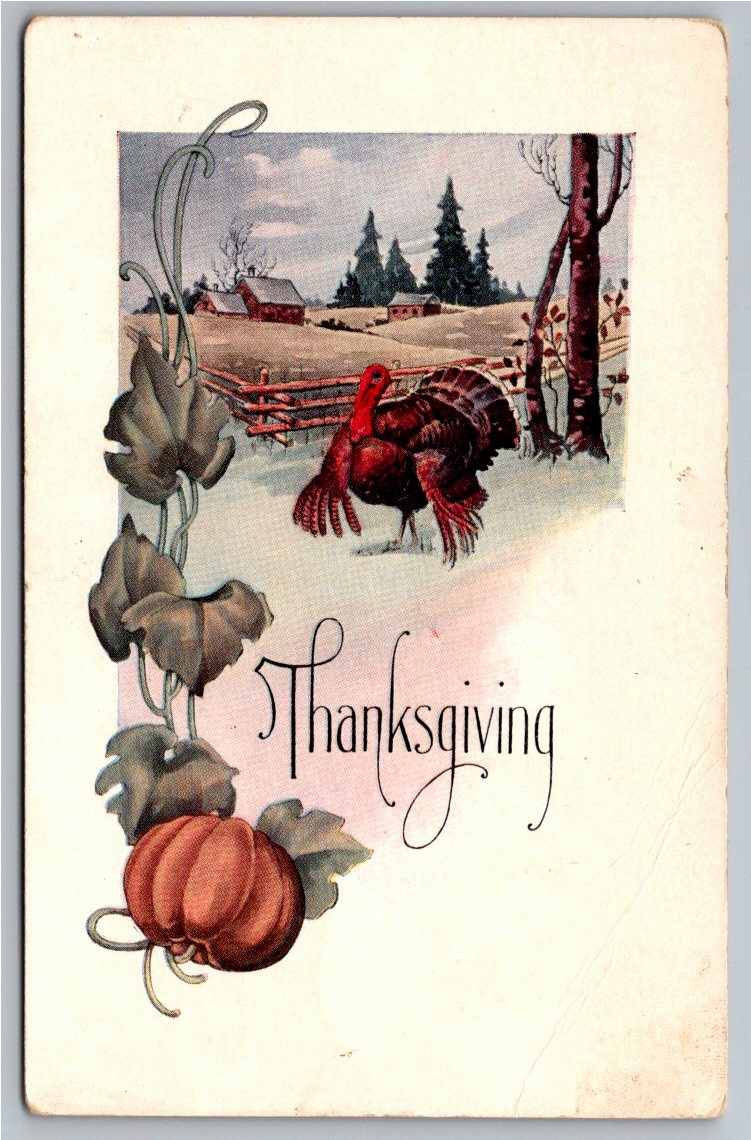
The front illustration features a proudly strutting tom turkey set against a serene countryside backdrop. In the midground, a classic wooden split-rail fence encircles a rolling pasture, leading the eye toward a quiet red barn and farmhouse beneath a late-autumn sky. Flanking the left margin is an elegant, stylized pumpkin vine with sweeping tendrils and broad leaves that frame the central motif, anchoring the composition in classic harvest iconography.
The Fairman Company and "The Pink of Perfection" Series
Produced by The Fairman Company of New York, this card bears their signature trademark series stamp, "The Pink of Perfection," featuring a delicate carnation graphic on the reverse side. Based in Manhattan during the height of the American postcard boom, The Fairman Company established a reputation for high-quality chromolithographic printing and refined design palettes. Unlike many brightly tinted cards imported from Germany during the era, Fairman production utilized softer, atmospheric tones—dusky greys, muted greens, and rich terracotta reds—that gave their holiday lines a distinctly artistic, understated warmth.
A Snapshot of Rural American Life in November 1914
Beyond its artistic merit, the reverse side of this postcard offers a compelling personal glimpse into small-town turn-of-the-century America. Hand-dated "Nov 26 1914"—the exact date of Thanksgiving that year—the card was affectionately addressed to Miss Grace Coulson of Manchester, Kansas, and signed by Ethel Hamme.
Divided-back postcards were introduced in the United States in 1907, allowing senders to write personal correspondence on the left side while reserving the right exclusively for the recipient's address. The crisp, fountain-pen cursive preserved on this card serves as a tangible link to rural Kansas during a pivotal moment in history, capturing how everyday Americans maintained connection across distance prior to modern telecommunications.
Preserving Pastoral Heritage and Ephemera
For collectors of holiday ephemera and vintage Americana, early Thanksgiving cards published by regional American houses represent an enduring genre. The combination of pastoral landscape work, stylized foliage graphics, and documented provenance makes pieces like this 1914 Fairman issue cherished historical artifacts. It endures not only as a decorative testament to historic printmaking, but as a genuine piece of early 20th-century social history.